How good is a model?
In Part 1 of this series, we described the fundamentals of a perceptron and ran basic experiments. Now that we have a perceptron, we can address the logical next step.
How would an ML algorithm perform against data the model has not seen?
The answer is, we won't know until we run the model against actual test data that were not used to train the model, i.e., not in the training dataset. We would hope that the training data was representative of the test data so the accuracy would be similar. Given how the perceptron was guessing a solution, the final line was clearly one of many possible lines that could separate the two groups within the training dataset. As such, we expect a slightly lower accuracy on data that are not part of the training set. Based on the plots in Part 1, we knew accuracy would be off because we could see that the original separating line (the red line, the line that divided the training data set) and the final 'guess' line were not on the exact same location and orientation. Recall that the perceptron did not know the location of the red line. All it did was find a line that separated the data points it could see! Sometimes it was close to the red line; at other times it was a little off.
Let us now explore the intuition around potential error on new data, using trial runs and diagrams. The good thing is that we can easily modify the perceptron from Part 1 to run new experiments.
Learning curve: Tracking model accuracy
It was visually obvious from the different graphs in Part 1 that the more training samples used, the better the guessed line due to more training data points restricting the possible final guesses.
But what is 'better'? One simple method is by calculating the percentage of points correctly classified by a model. For a perceptron, it should reach 100% accuracy on a linearly separable training data set. The accuracy would tend to go up after every correction. To visualize this, we will graph the level of accuracy against the number of updates to the parameters of the separating line $\mathbf w$. In ML, each update iteration is commonly called an epoch. The resulting plot is called a learning curve. The curve would typically be rising, increasing accuracy with more training. However, since models are typically compared based on their errors on a given dataset, most ML learning curves track the error percentage instead. It is also typical to see a learning curve plotted against the number of training data points, instead of the epochs.
Let us look at a few simple runs with $n=10$ and $\alpha=\{1, 0.1, 0.05\}$, using two runs of each $n$ and $\alpha$ pair. Note that the iteration does not start with zero accuracy. The initial random guess line might already classify some points correctly; it might even be outside the plot window. Also, the plot-curve GIF pairs might be loaded at different speeds, and become out-of-synch unfortunately. This can sometimes be remedied with a page refresh, which forces a reload of temporary local copies of the GIFs: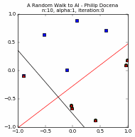


Training set accuracy vs training repetitions
Let us compare the accuracy of a perceptron on the training dataset against training repetition. If a perceptron is 'learning', we expect its accuracy to improve with more iteration. This is indeed generally the case. The accuracy generally increases with each iteration. This is clear in the diagrams above. Generally, because in some cases, when the update 'overshoots', the PLA ends up with a momentarily worse accuracy. These tend to happen with higher learning rates, e.g., $\alpha=1$, as we expected from Part 1.
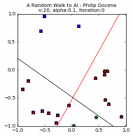
If we take learning rate as a proxy for the number of training repetition, since a small learning rate means small update steps, we can ask the following: does the learning rate have an effect on accuracy? We hold the number of training data points $n=20$ ($n=10$ is often too sparse) and vary the learning rate $\alpha$. Further, since we are tracking learning progress per iteration, we could ask an expanded question: does the learning rate have an effect on final accuracy, speed to reaching that final accuracy, and interim accuracy patterns?
We know that the PLA will always converge when run on linearly separable data, which is always the case in our data generator from Part 1 of this series. So the final accuracy is never in doubt. Any perceptron will have 100% accuracy over our randomly generated training data. Evaluating if intermediate accuracy levels rise faster under certain learning rates is a bit meaningless, however, because we always want to iterate as long as it reasonably takes to find a good accuracy rate. However, if there is a legitimate need to stop earlier (e.g., perhaps on complex models where iterations take a long time and some good enough accuracy could be used to stop iterations), it is worth observing how learning rates affect how fast the accuracy improves.
We compare two trials below, $n=20$ and $\alpha=\{1.0, 0.1, 0.05\}$. For each $n$ and $\alpha$ pair, the first three plots are for the three values of $\alpha$ while the fourth plot compares the different learning curves, c1 through c3.


[A couple of runs did not reach 100% accuracy. This is an example where we force the PLA to stop. Recall in Part 1 that we explored the possibility of terminating the PLA before it finds a solution, either because there is no solution, or perhaps a run is taking a long time to converge. In this case, we stop for practical reasons: the PLA repeats only up to a maximum of ~35 iterations to control the size of the GIF file :). Typically, the perceptron used in our experiments converges at less than 50 iterations when $n << 100$, so ~35 iterations is often sufficient.]
Based on the above, we note that the choice of the learning rate $\alpha$ does seem to affect the speed to convergence. This was a point we loosely assumed in Part 1, but now we have learning curves to support that claim. The learning rate affects how 'noisy' is the march towards convergence. High learning rates tend to converge faster, simply because the 'guess' line is jumping around and 'chances' upon a solution quickly, whereas a low $\alpha$ crawls toward the solution.
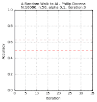
But is that really the case? Did we just get lucky with the few samples drawn? How about if we increase the number of samples $n$? A high $\alpha$ run might move quickly in the beginning, but it could have difficulty settling into a final solution when there is little room for maneuvering around. Time for another experiment, $n=50$.


It turns out that there is no clear correlation between the learning rate and the speed of convergence. All we could see is that the high $\alpha$ scenario quickly moves closer to a solution but might have difficulty reaching a solution when there is a mix of data points near the dividing line (that is, a high number of training sample points), causing the PLA to overshoot and the learning curve to rise and fall repeatedly. In contrast, a low $\alpha$ run is slow to get near a solution, but its gradual movement is more assured of reaching a solution even in 'tight' margins. Its learning curve is gradually but predominantly rising, with few dips. In other words, in high $n$ runs, the higher $\alpha$ settings tend to take longer! This is at odds with our earlier findings at low $n$'s.
So maybe the trend depends on low or high $n$. Yet, that's also not assured. Contrary to this new trend during high $n=50$ trials, a low $\alpha$ run --such as the ($n=50$, $\alpha=0.05$) diagram-- could also take longer than a higher $\alpha=0.1$ run, even with high $n$! This happened because this run made slow progress in its early steps, and never caught up to the higher $\alpha$ models. Our findings appear to be that there is no clear pattern, and we might be better served if we focus on reaching the maximum accuracy possible (100% in our linearly separable data), with the number of training iterations a secondary consideration.
While both high and low learning rate models would have the same accuracy on the training data (100%, converged), against unseen data, it could be argued that a reasonably high (meaning, high but will converge) $\alpha$ will often be more accurate than a very low $\alpha$ run. This likelihood happens because, during training, a low $\alpha$ run would likely find a solution near the edges of the separation space/margin of the training set, whereas a high $\alpha$ run could jump into the middle of the same margin. More often, the border separating two classes of the testing set data is not at the margins imposed by the training set data. Hence, the high $\alpha$ has a higher likelihood of being more accurate. [We can test this --intuitively, this would be more obvious on models run on a small number of training data-- but for now we move on to another experiment.]
So instead we could ask: what if we hold the learning rate $\alpha$ constant while varying the number of training data points $n$ (not training iteration)? While this sounds like another good experiment, this would lead us into the same result: the accuracy would be 100% at some point, and it would just be a question of how long do we want the iterations to last, presumably faster with a smaller value of $n$ due to wide data margins. Perhaps a better question is: would the accuracy on previously unseen data be better with more training data, after allowing a perceptron to fully converge first on such training data? This sounds like another experiment. Our intuitive guess is yes (more data, better line estimate), but we might as well run some experiments anyway.
Training set accuracy vs testing set accuracy
We want to see if there is some trend between a training set accuracy and accuracy on data not used in training. In ML terms, the training set accuracy is called in-sample accuracy while the testing set accuracy is out-of-sample accuracy. Continuing on the above, we can run experiments where we fix $\alpha$ and vary $n$, but this time we will track both training data accuracy as well as test data (out-of-sample) accuracy.
We will reuse the previous code and add more data points that we will not use for training. We first create a large population of data points $N$, then we extract a small portion out of $N$ for use as our training data point $n$. We train on $n$, and test on $N-n$. We then track two learning curves, the in-sample and the out-of-sample curves. We will also plot the out-of-sample points and observe how the perceptron misclassifies certain out-of-sample points.
The changes to the Python data generator code are below. Adding these to the base perceptron code in Part 1 should be trivial.
N = 500     # population
n = 10      # training sample size

# generate N random sample (population) using a uniform distribution from -1 to +1
P_N = np.array([np.random.uniform(-1, +1, N), np.random.uniform(-1, +1, N)])

# extract n points from population P as training points
X_n = np.array(P_N[:n, :n])

# determine the type of each point in sample X_n; false captures <=
type_mask = X_n[1] > slope * X_n[0] + b
type_mask_N = P_N[1] > slope * P_N[0] + b

# training data and population correct classification
y = [+1 if row == True else -1 for row in type_mask]
y_N = [+1 if row == True else -1 for row in type_mask_N]

# adjust vectors x in X_n and P_N to accommodate x_0
X = np.array(np.ones(shape = (n, d + 1)))
X[:,1:] = X_n.T
P = np.array(np.ones(shape = (N, d + 1)))
P[:,1:] = P_N.T

# initialize h for training set and h_N for entire population
h = np.array(np.sign(np.dot(w, X.T)))
h_N = np.array(np.sign(np.dot(w, P.T)))

# error masks and error curves
error_mask = h != y
error_mask_N = h_N != y_N
error_curve = []
error_curve_P = []

# out of error is entire population less in-sample
error_curve.append(1 - np.count_nonzero(error_mask) / np.size(error_mask))
error_curve_P.append(1 - ((np.count_nonzero(error_mask_N) - \
    np.count_nonzero(error_mask)) / \
    (np.size(error_mask_N) + np.size(error_mask))))
The plots of the different runs are below. Each run is presented via a pair of graphs: a scatter plot and a learning curve. The first group is from $n=50$, using two different learning rates each; the second group uses $n=10$.
This is similar to prior graphs, but let us look at the legends since this is now more cluttered.
The test data points are green 'x' and blue '+' dots. There are $N=10000$ of these points combined, out of which we extracted $n$ points. These became our training data points, but with the green 'x' changed to a circle and the blue '+' changed to a square. Misclassified training data points are labeled with a red upright triangle, while misclassified test data points are inverted yellow triangles (but seen as mostly black due to overcrowding). On the learning curves, we track two plots: the in-sample accuracy in green, and the out-of-sample accuracy in gold. The current accuracy of each curve is marked with dash lines.
Below are the runs for $n=50$.


Below are the runs for $n=10$. I further changed the colors to make identification easier. The training data points are now cyan squares (taken from the green x's) and orange circles (amid blue +'s). The misclassified test data points are now yellow tri-stars, avoiding the black outlines in the previous group. I then slowed the GIF for easier tracking.


No comments:
Post a Comment